 中文
How to Approve Yarn Colors for Knitwear Before Bulk Production?
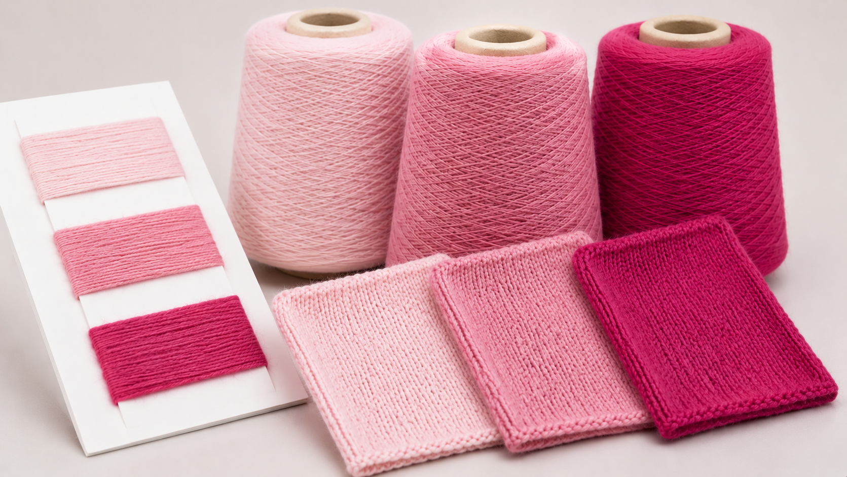
Color is one of the first things customers notice about a sweater. For fashion brands, getting the right shade involves more than selecting a color from a chart. The selected yarn also needs to produce the expected appearance when knitted into the actual fabric or garment.
A yarn shade may look suitable on a color card but appear different in a knitted sample. Lighting, fiber characteristics, yarn surface, fabric structure, and finishing can all influence how a color is perceived.
So, how should brands approach color approval before bulk production?
1.Start with a Clear Color Reference
Before selecting yarn, the brand should provide a clear color reference.
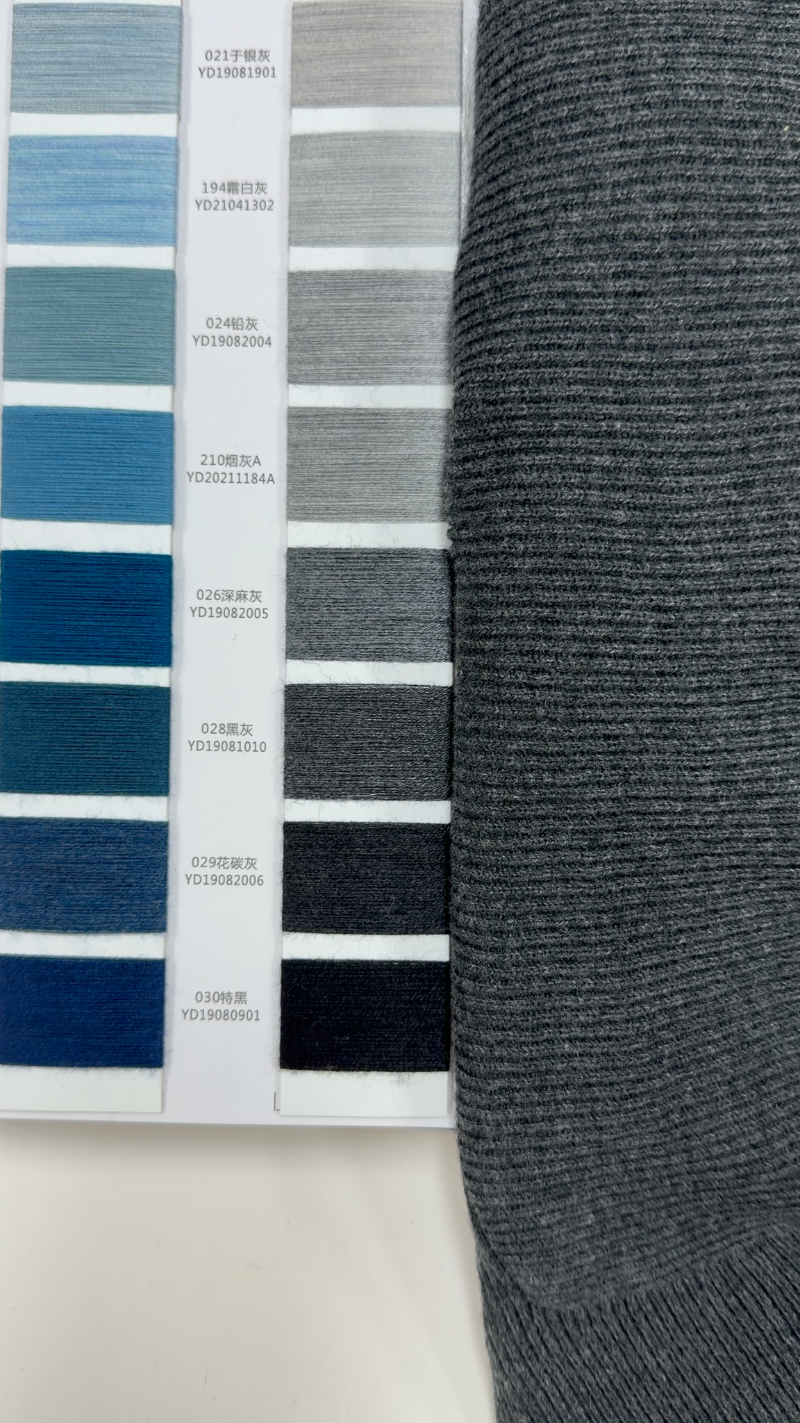
Common references include:
- A textile-specific Pantone reference, such as a Pantone Fashion, Home + Interiors TCX reference, where applicable
- A physical yarn or fabric swatch
- A reference garment
- A digital image showing the intended color direction
Pantone TCX is designed for textile and apparel applications, while TPG is intended for hard-surface applications. When using a Pantone reference, specify the correct color system and suffix.
However, even a standardized color reference is only a starting point. Different materials can present the same color differently because of their surface properties and interaction with light.
Digital images should also be treated as initial references rather than final approval standards. Screen settings and display conditions can affect how colors appear.
When color accuracy is important, a physical reference provides a more useful basis for comparison. The final shade should still be reviewed on the actual yarn and knitted fabric intended for the product.
2.Why Can Yarn Color Look Different After Knitting?
One common mistake is assuming that a yarn color card will look exactly the same once the yarn is knitted into a sweater.
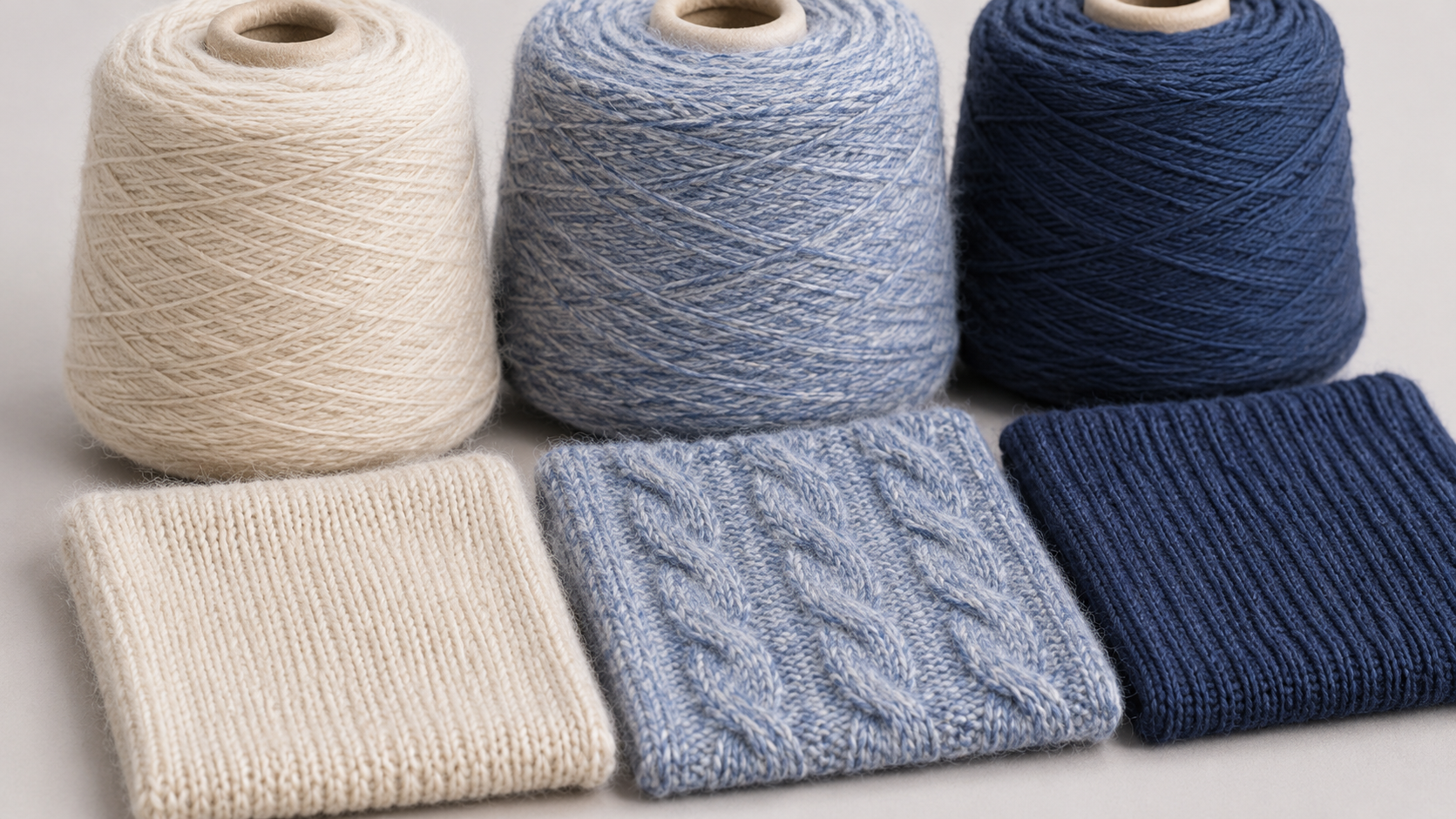
In practice, the final appearance can be influenced by several factors.
Yarn characteristics
Different fiber compositions, surface properties, and levels of luster affect how light interacts with the material. As a result, yarns with similar color references may not produce identical visual effects.
Knitted structure
Stitch construction and fabric density influence the surface appearance of knitted fabric. The same yarn shade may therefore look different in different knit structures.
Finishing
Processes such as washing, steaming, and brushing may change the surface texture, loft, or luster of knitted fabric. These changes may affect how the color is perceived, depending on the fiber composition and finishing process.
This is why color selection should not stop at the yarn card. A knitted swatch made with the intended yarn and fabric construction provides a more relevant reference for approval.
3.Why Does Lighting Matter When Comparing Colors?
Have you ever noticed that two colors look almost identical in one room but appear different under another light source?

This phenomenon is known as metamerism.
It occurs when two materials appear to match under one lighting condition but show a visible difference when the light source changes.
This is particularly relevant in textile development because different fibers, dyes, and surface structures can reflect light differently.
For knitwear color evaluation, comparing samples under only one lighting condition may not provide a complete picture.
Depending on the product and buyer's requirements, color comparison may be carried out under specified lighting conditions, such as:
- D65: A CIE standard illuminant representing average daylight, with a correlated color temperature of approximately 6,500 K.
- TL84-type fluorescent lighting: A fluorescent lighting condition that may be specified for retail-related color evaluation.
- Other specified lighting conditions: For example, lighting conditions relevant to the intended retail or end-use environment.
The relevant light sources should be agreed upon before color approval.
Samples should also be compared against a neutral medium-grey background, with consistent positioning, sample orientation, and viewing angles.
AATCC EP9-2025 provides a standardized procedure for visually assessing textile color differences by comparing specimens with a reference under defined viewing conditions.
Reference: AATCC EP9-2025 – Visual Assessment of Color Difference of Textiles.
4.Why Should Color Be Approved on a Knitted Sample?
A yarn color card is useful for initial selection, but it does not fully represent how the yarn will look in a finished knitted product.
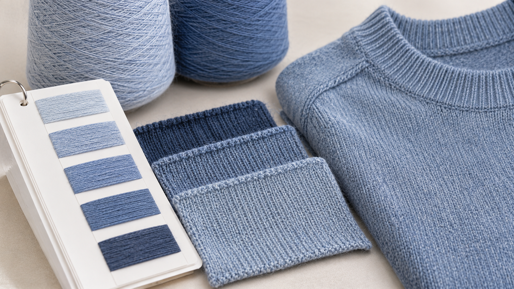
Before bulk production, brands should review a knitted sample made with the intended yarn and, as far as possible, the actual gauge, stitch structure, and relevant finishing process.
This allows the brand to assess:
- Whether the knitted fabric matches the intended color direction
- How the color appears with the selected stitch structure
- Whether surface texture or luster changes the visual effect
- Whether the appearance remains suitable after the relevant finishing process
For example, two similar shades of grey may look almost identical on a yarn card. Once knitted, differences in surface texture or luster may become more noticeable.
When two shades are close, comparing actual knitted swatches side by side under agreed lighting conditions is more useful than making a decision from a screen image alone.
Once approved, the physical sample should be retained as a reference for bulk production.
5.What Should Be Confirmed Before Bulk Production?
Once the color has been selected and approved, the relevant details should be recorded.
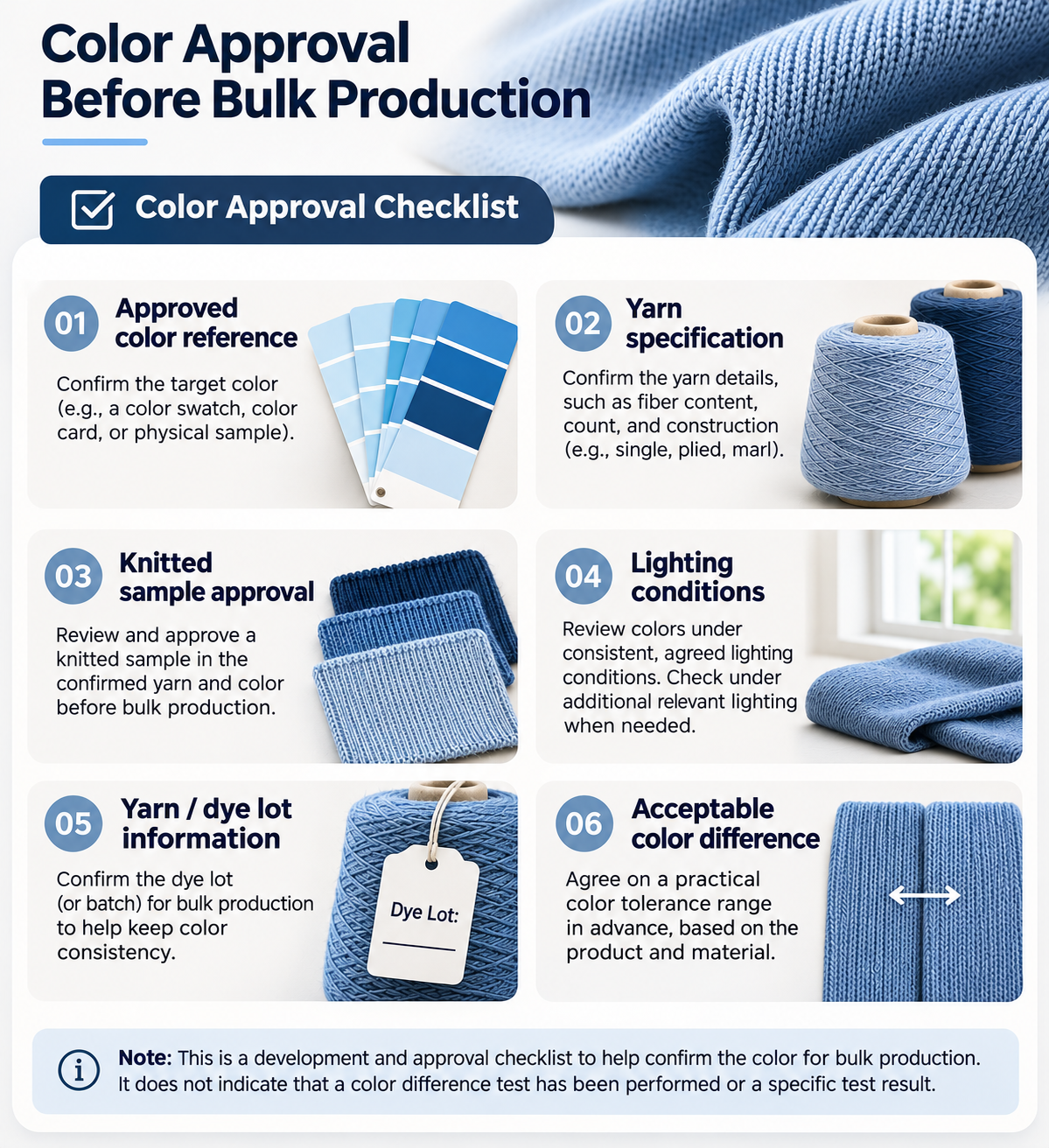
Here is a practical checklist for fashion brands:
1.Approved color reference
Record the selected color code, physical reference, and approved yarn shade. If Pantone is used, specify the exact system and reference.
2.Yarn specification
Confirm the fiber composition, yarn specification, and selected yarn shade.
3.Knitted sample approval
Keep the approved knitted swatch or sample as the visual reference for production.
4.Lighting and evaluation conditions
Agree on the relevant light sources, viewing conditions, and how color differences will be assessed.
5.Yarn lot and dye lot information
Where supplier information is available, record the relevant yarn lot or dye lot reference.
Ask whether the bulk yarn can be supplied from the same dye lot. If multiple lots are involved, agree on how shade differences will be reviewed and approved before production.
6.Acceptable color difference
If instrumental color measurement is required, agree on the measurement method and acceptable tolerance before production.
ISO 105-J03:2009 provides a method for calculating color differences between two specimens of the same material measured under the same conditions, using the ΔE_CMC(l) formula.
The acceptable tolerance depends on the intended end use and should be agreed upon by the brand and manufacturer. The standard does not establish one universal color tolerance for all knitwear products.
ISO 105-J03:2009 – Calculation of Colour Differences.
One important distinction: color matching and colorfastness are not the same.
Color matching concerns how closely a material matches an approved shade. Colorfastness concerns how well its color withstands conditions such as washing, rubbing, or light exposure.
If both are important to the product, they should be specified separately.
The Key Takeaway
Color approval involves more than selecting a shade from a yarn card.
The actual knitted structure, material characteristics, lighting conditions, and finishing process can all influence the final appearance.
For fashion brands, the most practical approach is to provide a clear color reference, review the actual knitted sample, and agree on the approval criteria before bulk production.
A yarn color card is a starting reference, not the final color approval.
A clear approval process helps reduce misunderstandings and gives both the brand and manufacturer a more consistent reference for production.
Developing a Custom Knitwear Collection?
Share your design reference, preferred color, and material requirements with our team. We can review available yarn shades with you and discuss suitable options during sample development.
The selected shade can then be reviewed on a knitted sample before bulk production.
Contact Us About Your Knitwear Project
References
- Pantone. Fashion, Home + Interiors Color System. Official Pantone information.
- American Association of Textile Chemists and Colorists (AATCC). EP9-2025: Evaluation Procedure for Visual Assessment of Color Difference of Textiles. Official AATCC page.
- International Organization for Standardization (ISO). ISO/CIE 11664-2:2022: Colorimetry — Part 2: CIE Standard Illuminants. Official ISO page.
- International Organization for Standardization (ISO). ISO 105-J03:2009: Textiles — Tests for Colour Fastness — Part J03: Calculation of Colour Differences. Official ISO page.
- AMANN. Metamerism – When Matching Colours Change Under Different Light. Technical reference.